Quarantine has been harsh and boring, and unfortunately a part of daily living for several months. Despite the numerous complaints, however, few are thinking about how to live better during these harsh periods. If you remember how, late last year, thousands of New Yorkers stood on their porches and near their windows to applaud first responders and health care workers on the frontlines of the coronavirus outbreak, you may consider staunching your complaints. In the face of this overwhelming negativity, Sean Dong, whose work published in The New York Times, creates an imaginative half-minute animation to illustrate why people should feel luck instead of loss while at home in quarantine.
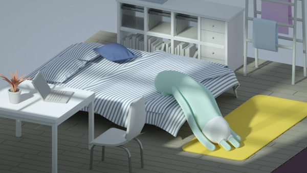
The animation, Quarantine Testimony, depicts a peculiar character’s average day at home. When it wakes up every morning basking in the sunshine, it feels no rush to brush its teeth or run to subway stations. It has plenty of time to do Yoga before participating in online meetings. If it feels bored but can’t hang out with friends, it entertains itself with a good-spirited one-man pillow fight. When it’s finished, it finds time to call its boyfriends and girlfriends to talk tirelessly about its relaxing daily life. “I want to amuse people and make people feel ‘this is exactly what I would do in quarantine.” Sean elaborates.

(Quarantine Testimony)

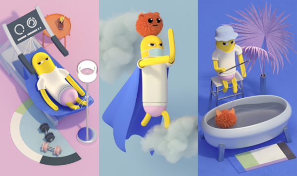
(Home Warrior - The Work For Google Team)
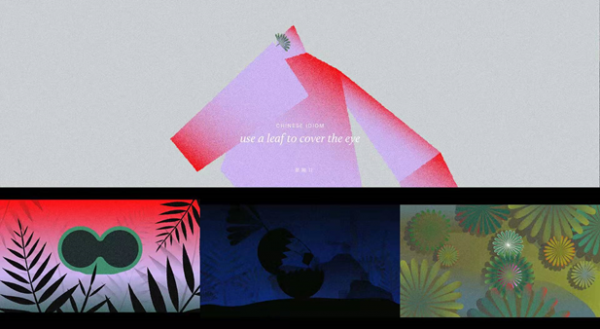
This is not the first time Sean has integrated his intelligence with real issues on motion design. The majority of his previous projects are more than just absentminded drawings, but rather motion branding. “How to effectively express core messages within a few seconds is the priority in motion design.” He says, referring to his motion design masterpiece Use A Leaf To Cover The Eye. This project’s name is derived from a Chinese idiom in which a man believed that a leaf was magic and could make human beings invisible. So, he recovered that particularly magic leaf and placed it on one of his eyes. He then went to a store to steal but was caught immediately. Sean selected abstract graphics to depict the male character and applied authentic Chinese painting styles throughout the entire work. He depicts the complicated characters as concise geometric graphics, which strengthen the core idea of the idiom. Sean reminds people through this careful use of color and style not to neglect the blueprint, especially in the face of tiny (yet imperative) details.

(Use A Leaf To Cover The Eye)
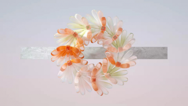
However, what Sean most cares about is satisfying the audience through motion content. He explains, “I want to know when and how people will feel satisfied, and that’s why I created Biophilia.” Biophilia displays a therapeutic journey of the sense of satisfaction. It elevates the sensory experience with looping 3D animations and therapeutic ASMR sounds. Both repetitive flower loops and melting square cubes carry viewers into a world of bliss.

(Biophilia)
The ultimate goal for him is to use motion design to record his personal story. His catchphrase has always been “Motion design is not only about moving objects, but expressing emotion in our daily life.” Nowadays, he works as a motion designer for The New York Times and will continue to bring more revolutionary works to his viewers for years to come.
Website: https://seandong.com/
Instagram: https://www.instagram.com/sean_xdong/
Media Contact
Company Name: Hummingpress
Contact Person: Fiona Zhu
Email: Send Email
Country: United States
Website: https://seandong.com/


