The day has finally arrived. The latest version of macOS is here, after a seemingly endless wait. That wasn’t just your imagination, either. Sure time is basically meaningless now, but this one did take a while to arrive, with nearly five months between its announcement at WWDC and today’s public release.
There are, no doubt, plenty of reasons for this. Among other things, this has been an usual year, to put it as benignly as possible. This also marks a pretty big annual update for the desktop operating system. And then, of course, there’s the fact that this is the first version of macOS expressly built for the company’s new Arm-based Macs — the single largest change to Apple hardware in roughly 14 years.
I’ve been running a beta of the operating system on one of my machines since June, along with developers and a smattering of brave souls. I’m not saying we’re heroes — but I’m also not not saying that. At the end of the day, it’s not for me to say.
The update brings a slew of design updates — many of which continue the longstanding trend of blurring the line between macOS and iOS. It’s a trend that may well intensify as Apple silicon ushers in the next era of Macs. At the very least, it makes sense from the standpoint of iOS having long ago taken the pole position in Apple’s software design. The mobile operating system has been the first to introduce many features that have eventually found their way onto the desktop.
Image Credits: Brian Heater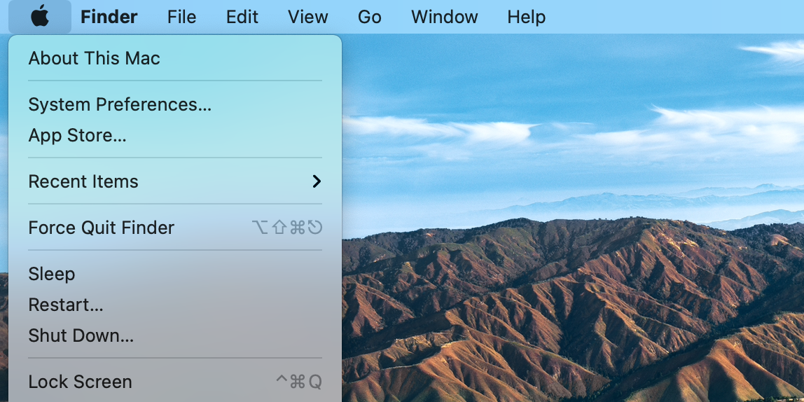
Many of the changes are subtle. The menu bar is taller and more translucent, changing with different backgrounds and as the system toggles between light and dark mode. The Finder dock now floats a touch above the bottom of the screen and menus have a little more space to breathe. Windows offer a bit more space, as well, along with a smattering of new symbols scattered throughout first-party apps like Mail and Calendar.
Image Credits: Brian Heater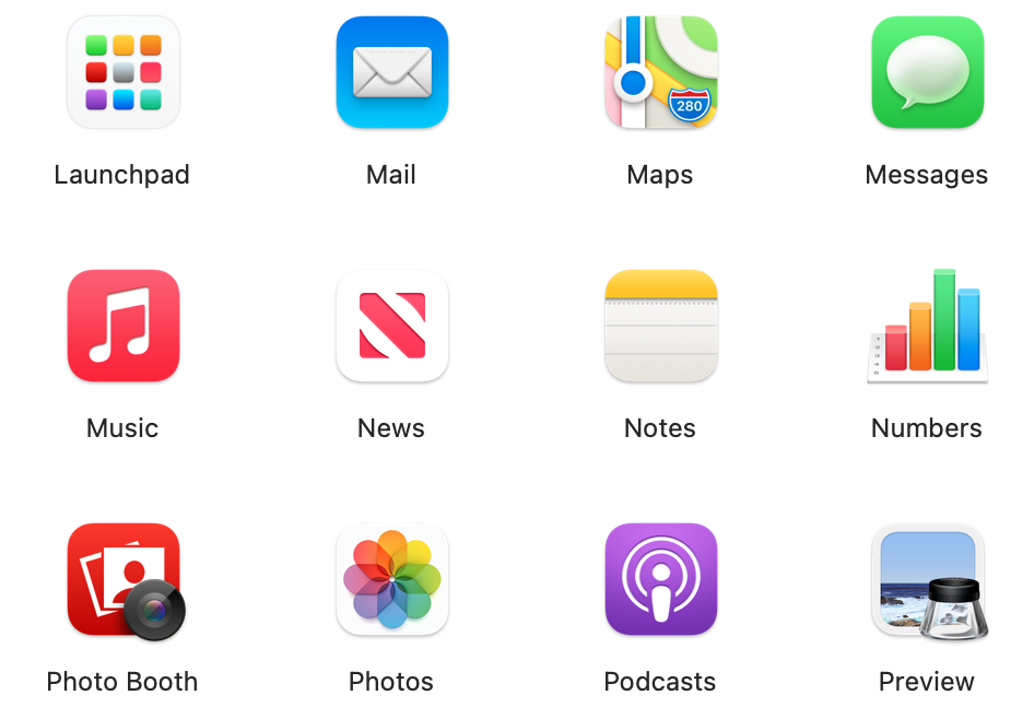
The shapes of the icons have changed to a more iOS-like squircle design, with subtle touches throughout — the Mail icon, for instant, sports the address of Apple’s HQ in barely visible text: “Apple Park, California 95014.” Like many of the other touches, the key is offering up a kind of stylistic consistency, both throughout Big Sur and across the Apple ecosystem.
Image Credits: Brian Heater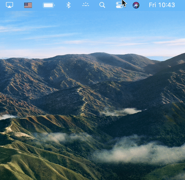
The most immediate and obvious change to the finder, however, is the addition of the Control Center. The feature is borrowed directly from iOS/iPadOS, bringing a simple, clean and translucent pane down to the right side of the screen. You can drag and drop the panels directly into the menu bar. It brings to mind the sort of control center functionality the company introduced with the Touch Bar, but more than anything the big buttons and sliders beckon you to reach out and touch the screen. It’s really hard to shake the feeling that the company is starting to lay the groundwork for future touchscreen Macs running Apple silicon.
Image Credits: Brian Heater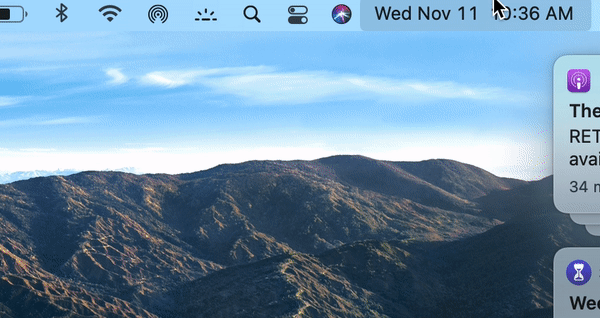
I won’t lie: I’ve never been a big Notification Center user. I understand why Apple thought to bring the center to the desktop several updates ago, but it’s just not as centralized as it is on mobile. Nor does it fit into my existing workflow. Apple has continued tweaking the feature — and it gets a pretty sizable overhaul here. Like much of the rest of the updates, it’s about how Apple uses space.
Now accessible by clicking the date and time in the menu bar (versus a devoted button), the two most appealing changes here are grouped notifications and widgets. Again borrowing from iOS, notifications are now stacked by group. Tapping the top of the pile will expand them down. You can “X” them out on the side to make them go away — but again, a swipe would be more satisfying. Also notable is the ability to interact with notifications. You can reply to messages or listen to podcasts straight from the river. It’s a nice addition for those who already use the feature as part of their workflow.
Image Credits: Brian Heater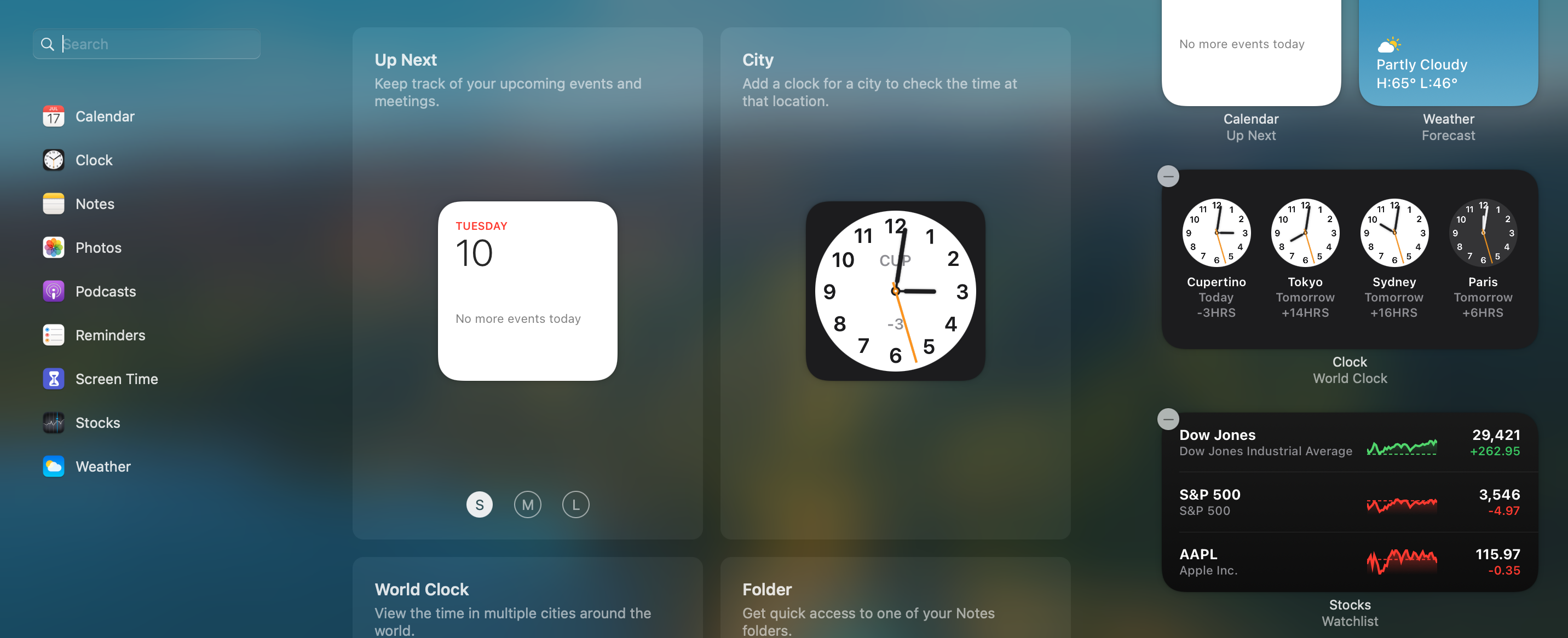
The system also joins the latest version of iOS with the addition of new widgets into the Notification column. Currently the list includes first-party apps like Calendar, Weather and Podcasts, along with additional widgets available via the App Store. You can add and remove widgets and resize them. On a screen with enough real estate, it might be nice to pin them to the top, so they can stay open and anchored in place, while you’re working in other applications.
https://techcrunch.com/wp-content/uploads/2020/11/big-sur-move-file.wav
Sounds, too, have been updated throughout. The changes are mostly subtle, as in the case of the newly recorded startup chime. More pronounced are changes like moving a file, which has a nice humming sound — more pleasant that the old cold spring noise. Here’s a much better rundown of all of the sounds than I currently have time to put together:
A number of first-party apps get some key updates here. Safari is probably the biggest of the bunch, starting with the welcome page. You can set the background image, using something from your own library — or a pre-picked photo from Apple. It might be nice to have something a bit more dynamic, cycling through a series of handpicked images or using AI to choose the best from a library, but otherwise the implementation is good — and it’s nice to see something familiar when you open a new tab (in my very specific case, a rabbit who also lives rent-free in my apartment).
Image Credits: Brian Heater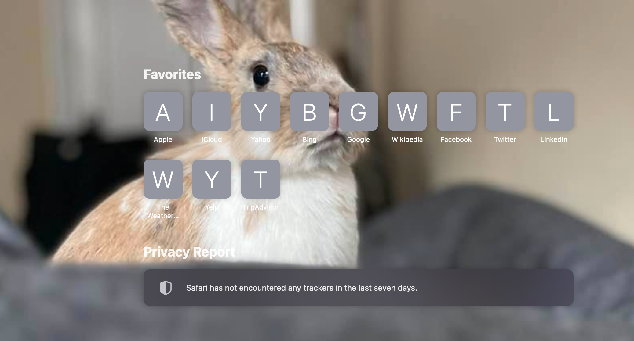
Beyond that, home-page customizations include toggling between favorites, frequently visited sites, your reading list and even security reports, which tell you things like the number of trackers Safari has blocked. Clicking into that last bit offers up a more detailed profile of the specific trackers it blocked and which sites are doing the tracking. Apparently 80% of the sites I’ve visited with Safari on this computer use them — which, yikes.
Built-in translation in Safari is a nice step toward taking on Chrome — Google has been a longtime leader in translation services. Apple’s browser has great market share on mobile (thanks in no small part to being the default browser on iOS), but studies tend to put it at somewhere around eight to 10% of the desktop market share. Currently, however, the system is still in beta and the translation options are still limited, including: English, Spanish, Simplified Chinese, French, German, Russian and Brazilian Portuguese. Apple will no doubt continue to update that list.
Image Credits: Brian Heater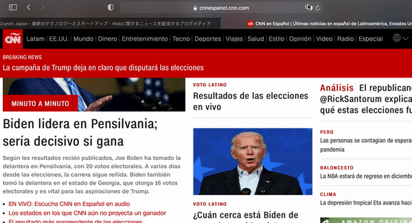
One piece that I do dig are website previews, which can be accessed by hovering over a tab. That’s a nice addition for those of us who tend to go overboard with tabs — which I have to imagine is many or most people, these days. Apple has also added site favicons to tabs, which should also help you identify them quicker.
Image Credits: Brian Heater
Things have been improved in the backend as well, with quicker site rendering and better power efficiency. The company says you should be able to get up to three extra hours of battery streaming video on Safari versus Firefox and Chrome. Seems like a pretty big discrepancy, though there are, no doubt, advantages to using first-party software. Even if the company still has a steep hill to climb with regards to desktop market share. Maps is another place where Apple’s got some pretty stiff competition from Google. At last measure, Google Maps has something like 67% market share. Apple’s offering got off to an admittedly slow start out of the gate, but the company’s been pushing pretty hard to catch up to — and in a few spot surpass — Google.
Image Credits: Brian Heater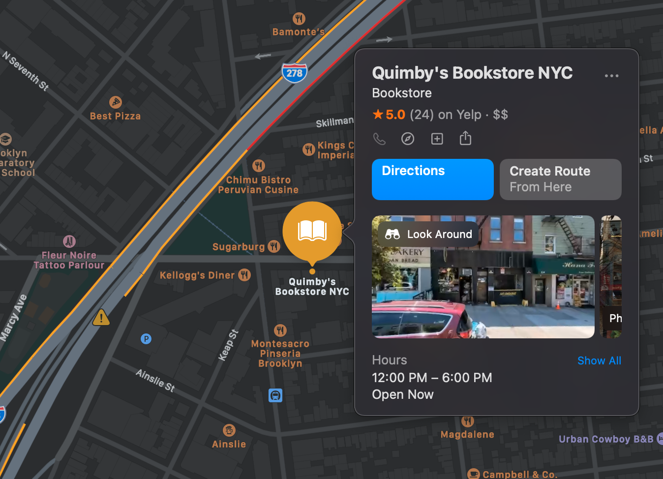
Of course, many of these updates are the sort of things that will be easier to check out when there isn’t a pandemic happening. Meantime, things like the 360-degree Look Around (Apple’s Street View competitor) is a nice way to live vicariously. Indoor Maps, too, though the feature is still relatively limited. You can check it out in select spots like airports and indoor shopping malls. Other key additions include electric vehicle routing to plan trips around charging stages, cycling directions and mapped congestion zones for traffic in major cities.
Image Credits: Brian Heater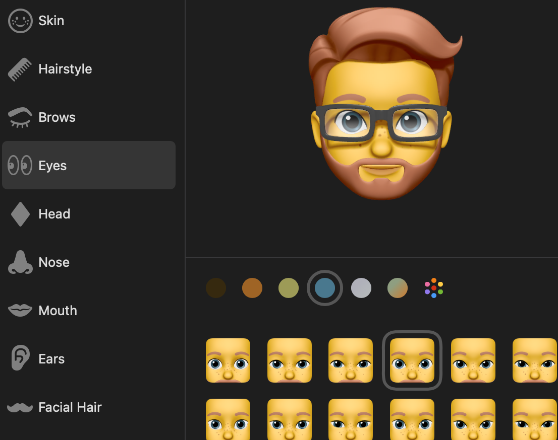
A handful of updates to Messages warrant mention here — many of which were also introduced with the latest version of iOS (a rare bit of cross-OS parity that could, perhaps, become more common going forward). In this case, it’s clear why the company would want to roll some of this stuff out all at once.
Here’s everything Apple announced at the ‘One More Thing’ event today
Messages is just more robust across the board on the desktop with this update. The list includes a Memoji editor and stickers, message effects like confetti and lasers and an improved photo chooser. Conversations can be pinned to the top of the app and group chats have been improved to include group photos, inline replies to specific messages and the ability to alert users with the @ symbol. It’s not quite a Slack replacement, nor is it trying to be one.
After months of beta, Big Sur is finally here. It boasts some key upgrades to apps and the system at large, but more importantly from Apple’s perspective, it lays the groundwork for the first round of Arm-powered Macs and continues its march toward a uniformity between the company’s two primary operating systems.

