


When designing a website, it’s easy (and fun!) to focus on layout and content. But one crucial element that often gets overlooked is color. Color plays a vital role in web accessibility, ensuring that all users—regardless of visual impairments or color vision deficiencies—can easily navigate and engage with your content.
Proper color contrast is key to making text readable for those with low vision or color blindness. In this post, we’ll explore why color is so important for accessibility and how to create a color palette that ensures your website is inclusive and user-friendly for everyone.
Why color is important for accessibilityColor, specifically color contrast, is central in ensuring web content is accessible, particularly for users with visual impairments, color blindness, or low vision.
Someone with low vision may struggle to read text with poor contrast, such as light gray text on a white background. Users with color blindness may find it difficult to differentiate between certain colors, such as red and green, if the contrast is insufficient. High-contrast design helps bridge these gaps.
Not only that, accessibility isn’t just a best practice—it’s becoming a legal requirement in many parts of the world. The European Accessibility Act (EAA), taking effect in 2025, will require digital products and services, including some websites, to meet certain accessibility standards like sufficient color contrast, avoiding color-dependent information, and following Web Content Accessibility Guidelines (WCAG). Non-compliance could lead to fines, making accessibility an essential priority for businesses serving the EU market.
Beyond its impact on accessibility, proper color contrast also benefits all users, including those viewing content in challenging environments. Bright sunlight, low-quality monitors, or small screen sizes can make low-contrast elements harder to see for anyone.
What makes a color palette accessible?While color contrast is central to the accessibility of color, there are other things you can do to make the color on your site even more accessible. All of these elements come together to ensure optimal color accessibility:
- Sufficient contrast: Colors must have enough contrast between the text and background to meet WCAG—more on contrast ratios below.
- Avoid relying on color alone: Information shouldn’t be conveyed through color alone. For example, add an underline to links or use icons to support color-coded elements.
- Color blindness considerations: Choose combinations that are distinguishable for users with common types of color blindness, such as red-green or blue-yellow deficiencies.
- Consistent use of color: Maintain consistency in how colors are used throughout your design. This helps users quickly understand an element’s meaning and function.
- Testing across devices: Colors may appear differently on various screens and under different lighting conditions. Testing ensures accessibility in real-world scenarios.
By considering all these elements, you can create a site that is both functional and inclusive.
 Example from WebAIM demonstrating the use of other elements, like underlines and icons, to support color-coded elements. What is a contrast ratio?
To better understand if your site’s color palette is accessible, it’s important to understand how color contrast is measured.
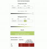
Color contrast ratio is a numerical value that represents the difference in luminance (light intensity) between two colors, such as the text and its background. It is calculated as a ratio, with values ranging from 1:1 (no contrast, e.g., white text on a white background) to 21:1 (maximum contrast, e.g., black text on a white background). A higher ratio indicates greater contrast, making it easier for users to distinguish between the foreground and background elements.
The Web Content Accessibility Guidelines (WCAG) recommends a minimum contrast ratio of 4.5:1 for most text and images of text, and 3:1 for large text (at least 18 point or 14 point bold and above).
Example of a low contrast ratioTake this example of a light green button with white text. It may look legible to you, but upon further inspection, using the Chrome Accessibility tools in the Chrome browser, the contrast ratio is quite low at 1.71:1. As such, the text on this button would be difficult for many users to read.
 Here’s how a low contrast button appears flagged in the Chrome Accessibility tool, along with other accessibility details for the element. How to test for accessible color combinations
Testing color combinations for accessibility is straightforward with the right tools. Here are some of our most trusted tools for testing colors:
- Chrome Accessibility Report: This tool is an easy-to-use resource built right into the Chrome browser when you want to quickly test a single page or element on your site.
- Equalize Digital Accessibility Checker: This freemium WordPress plugin from Equalize Digital goes beyond just colors to ensure your site is accessible to a wide range of visitors.
- WAVE Web Accessibility Evaluation Tool: A free tool you can use to scan any page on your site for accessibility issues. When you’re looking to improve colors, check for the “contrast errors” part of the report.
- Deque University contrast checker: Use this free tool to check a color combination you’re unsure about.
Many design programs, such as Adobe and Figma, include built-in accessibility tools or add-ons that allow you to analyze color contrast directly within your design files, allowing you to address accessibility considerations early in the design process—even before development begins.
 Some beautiful, accessible color combinations and themes
Finding accessible color combinations doesn’t mean sacrificing aesthetics. Here are some of our favorite high-contrast designs in the WordPress.com theme directory:
 High contrast Koinonia theme from WordPress.com. Koinonia
The Koinonia theme is ideal for building community-focused websites, such as nonprofits and churches. It features a clean, modern layout with a focus on readability and easy navigation. It adheres to accessibility standards, with features like proper color contrast, keyboard navigation support, and screen reader compatibility, which helps differently abled users access content effortlessly.

| Darkest Black #030203 | Berry Sorbet #FB6669 | Dark Sangria #560122 |
 High contrast Conference theme from WordPress.com. Conference
The Conference theme is thoughtfully designed for event and conference planners, combining functionality with accessibility to create an inclusive experience for all users. Its design emphasizes clear, intuitive navigation and offers support for high-contrast color settings, ensuring content remains readable and usable for individuals with visual impairments.

| Signal Blue #345EFC | Emerald Glow #49EF7C | Deep Black #1E1D2C |
 High contrast Fixmate theme from WordPress.com. Fixmate
This theme from the WordPress.com team features clean, high-contrast text on light backgrounds, ensuring maximum readability for users with visual impairments. The theme adheres to accessibility best practices by using logical heading structures, keyboard-navigable menus, and link styling that avoids reliance on color alone for identification.

| Golden Marigold #FDC62A | Midnight Cola #0F0C0C | Tidepool Jade #2D92A1 |
Want a more customized look? When you’re ready to build, WordPress.com makes it easy to define and implement an accessible color palette for your site on Premium plans and above. You can customize these themes with the colors of your choosing, but be sure to always verify your color contrast ratios and test them in different contexts, such as buttons, headers, and body text.
A final word on accessible colorAccessible design is not just about meeting standards; it’s about creating experiences that welcome everyone. By prioritizing color accessibility, you’re taking a meaningful step toward a more inclusive web.
Want to learn more about building an inclusive WordPress site? Here are a few resources to get you started:
